
A new website is a big undertaking for any marketer, no matter the size of the business they work in. For small teams, how do you build something that shows your strengths against larger competition? For larger organisations, how do you properly reflect all the value you can offer customers, and retain market share?
Your website is the most important piece of online collateral your business has, especially if you’re looking to use ecommerce. Unfortunately, you only have a short time for your website to make an impression. 88% of online users won’t visit a site again after a poor experience.
Today we’ll break down the factors that lead to those poor experiences and solutions to help your business navigate each of them.
1. Why responsive design is non-negotiable
The challenge:
As of July 2024, global internet users are almost 50% more likely to be viewing your website on a mobile rather than a desktop.
Source: StatCounter Global Stats – Platform Comparison Market Share
However, there are still plenty of business who develop their sites exclusively with desktop in mind, see that it looks great there, and call it a day.
You don’t need us to tell you why this is a mistake, but depending on what you are trying to offer from your website it could be disastrous. 91% of ecommerce sales were made on a smartphone in the past year, without a mobile-optimised website, you could miss out on an enormous proportion of potential business.
The solution:
Responsive design is now such a must-have that site builders are making it easier to test how your website will look on multiple devices. WordPress allows you to preview your site on various viewport sizes to test if your content and design elements scale correctly on each device.
While these previews are helpful, we do recommend checking your sites on a range of real hardware to test whether your site is truly responsive.
2. Poor menu navigation
The challenge:
This is often a case of style over substance. On a mission to create a strong visual impression on a website, plenty of designers have made it incredibly challenging to get to where you need to.
Menus can be affected by text that’s too small, or blends in too closely with the background to be clickable. Some sites use multi-layered menus to declutter their home screens, but this has disadvantages too. If your most popular content is hidden two layers into these menus, it becomes incredibly frustrating for users to find what they’re looking for.
The solution:
With a good menu structure, sometimes less is more. Your menu is the only element of your site’s information architecture your audience will get to see, it’s an opportunity to show you’ve considered their experience.
We recommend using a relatively simple top level menu, but including more relevant detail in your sub-navigation (the options that open up when you hover over a menu item). This allows users to access all the information they need to find, while still hiding unnecessary clutter. If you also want to include a full menu somewhere on your site, use your website’s footer.
For more SEO guidance, check out this article.
3. Failing to grab attention
The challenge:
The average time spent on a website is 45 seconds. Most users spend most of this short time figuring out whether they have found the correct website. This means that if your site doesn’t immediately grab their attention, and confirm that they’re in the right place, they won’t stick around.
The Solution:
This is the point you need to consider your site hierarchy. You need to consider those 45 seconds, and what you can show your audience in that time.
Our advice is displaying the purpose of each page of your site above the fold, i.e. Without anyone having to scroll to find it. You should also tag each element of your content with the appropriate heading tag. H1 for your page title, H2 for important subheadings, and H4 for any text you want to highlight. Google will read your heading tags before the rest of your content and use this to decide what to rank your site for.
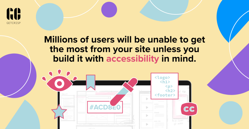
4. Not focusing on accessibility
The challenge:
This one is a must. Millions of users will be unable to get the most from your site unless you build it with accessibility in mind. Even if your design looks amazing, if it creates a usability barrier, it won’t help you meet your business objectives.
The solution:
There are some accessibility essentials you have to follow when building your site, check out this article for more information. Here are some tips to get you started.
- Make sure you write alt-text for every image on your site, so screen readers can accurately describe what is there.
- Make content and images easy to see or hear by keeping text size and colour contrast within recommended guidelines.
- Avoid content that features flashing or blinking animations.
- Provide transcripts or subtitles for any video or audio content.
- Ensure all your content is readable in your website’s plain text mode.
5. Burying your most important content
The Challenge:
Building a strong customer journey into your website is a great way to drive conversions. You need to make sure that the elements of this journey actually convert though, otherwise you risk missing out on genuine enquiries.
For example, if your contact form or book a call button is sat at the end of a carousel of text or images, it’s unlikely that a user is going to scroll through five different slides to find it. No crucial elements of your site should be inaccessible if a user doesn’t interact with your content.
The Solution:
Design your customer journey with your laziest user in mind! Limit the amount of content that users have to scroll through to access the next step on their journey. If people want to read on and learn more, they will do. But it’s crucial that you guide your reader to the next step on their journey first and foremost. For tips on how to structure your web content, read more here.
Are any of these mistakes on your website?
If you have any questions about the challenges we’ve listed here or any others, feel free to get in touch.