Like every creative field, graphic design is always evolving and changing. More than many others though, it’s a field businesses need to stay on top of. There is no overstating the appeal that a strong visual element can add to your marketing, and your competition already knows this.
To help inspire your next campaign, we asked Louis Barron, a member of GetCrisp’s design team to explain five design trends that are set to emerge across the digital marketing space in 2023.
Mixed 2D/3D Elements
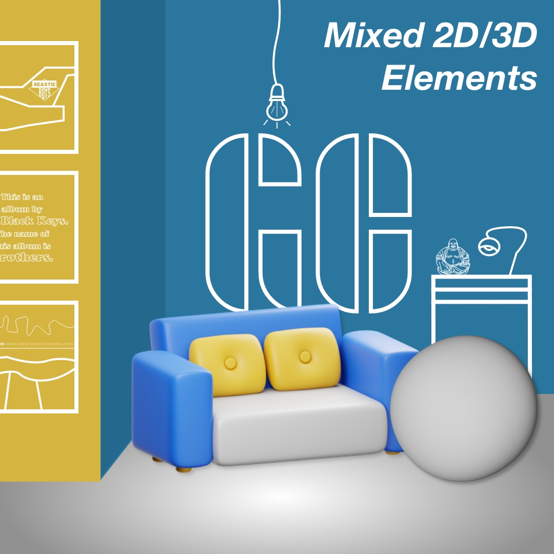
When attempting to better market individual products or services, it can be difficult to draw your audiences’ eyes to the areas you know they should be excited about. To make a difference here, let’s look at how combining a mix of 2D and 3D elements can better communicate your next campaign.
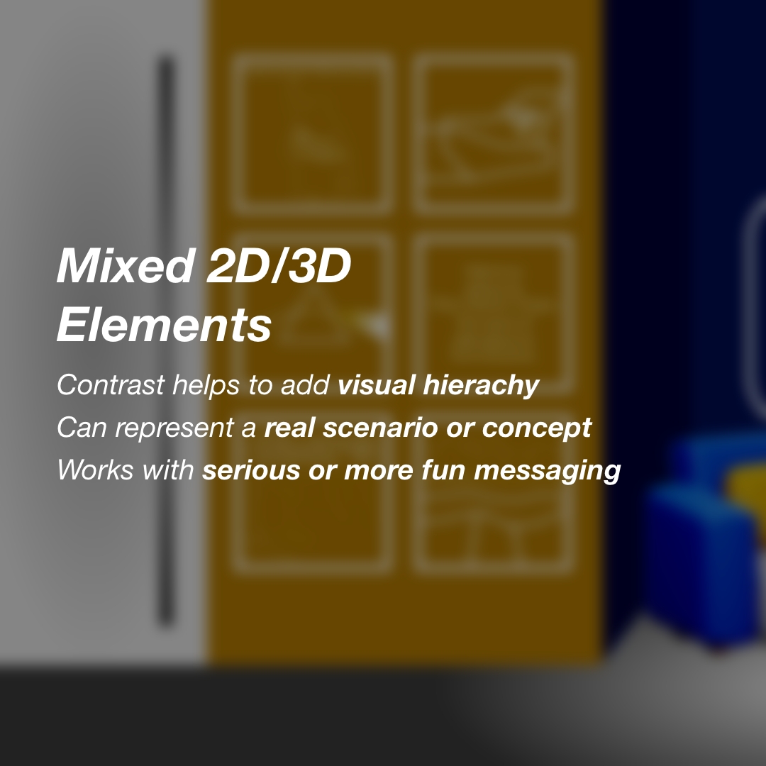
In this style, the stark contrast of isometric and flat elements can help to add natural hierarchy, that draws the consumer’s eye to the most important area of a design. Neutral, flat tones and sharp lines help with the 2D elements, while the use of deep shadows, softer edges and strong lighting really allow the 3D elements to stand out.
The design can be expressed through either a cartoon style, or a representation of a real scenario. This in itself adds a layer of flexibility to the design from a brand positioning standpoint. Your brand’s appearance could be serious or more relaxed, and this design allows both to be expressed freely. It also allows a mundane product or service to be brought to life in a more visually exciting way on social channels or websites.
Natural Colours
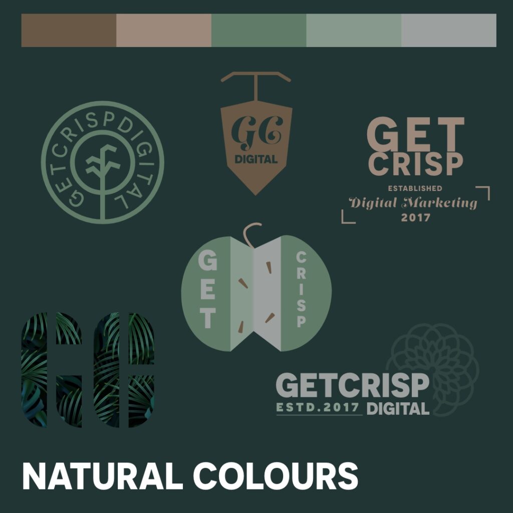
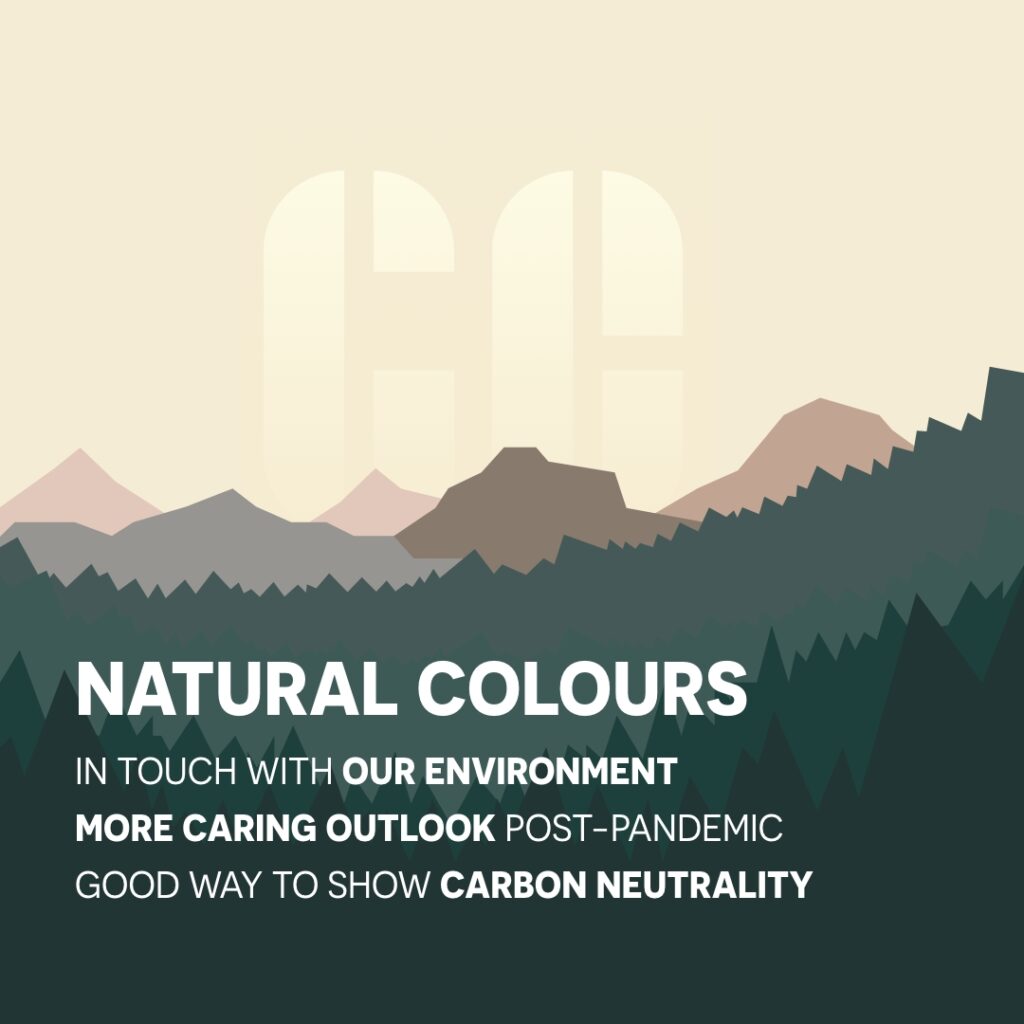
A design trend that’s really taken a foothold in modern design is the use of more natural, earthy tones and elements. Your business’ audience are more informed and environmentally conscious than ever. Prospects now take time to check out a business’ green credentials before agreeing to work with them. One way to highlight yours is through the use of natural colours in your marketing.
As more businesses want to show they care about our environment and are pushing for carbon neutrality, incorporating this design style into products, social posts and websites can show to potential clientele that your company is more forward-thinking and progressive than the competition.
Given the events of the past few years, going outside hasn’t been quite the same, and this might explain the shift in interest towards a more nature-inspired theme, as we slowly begin to reconnect with the outside world.
Nostalgia
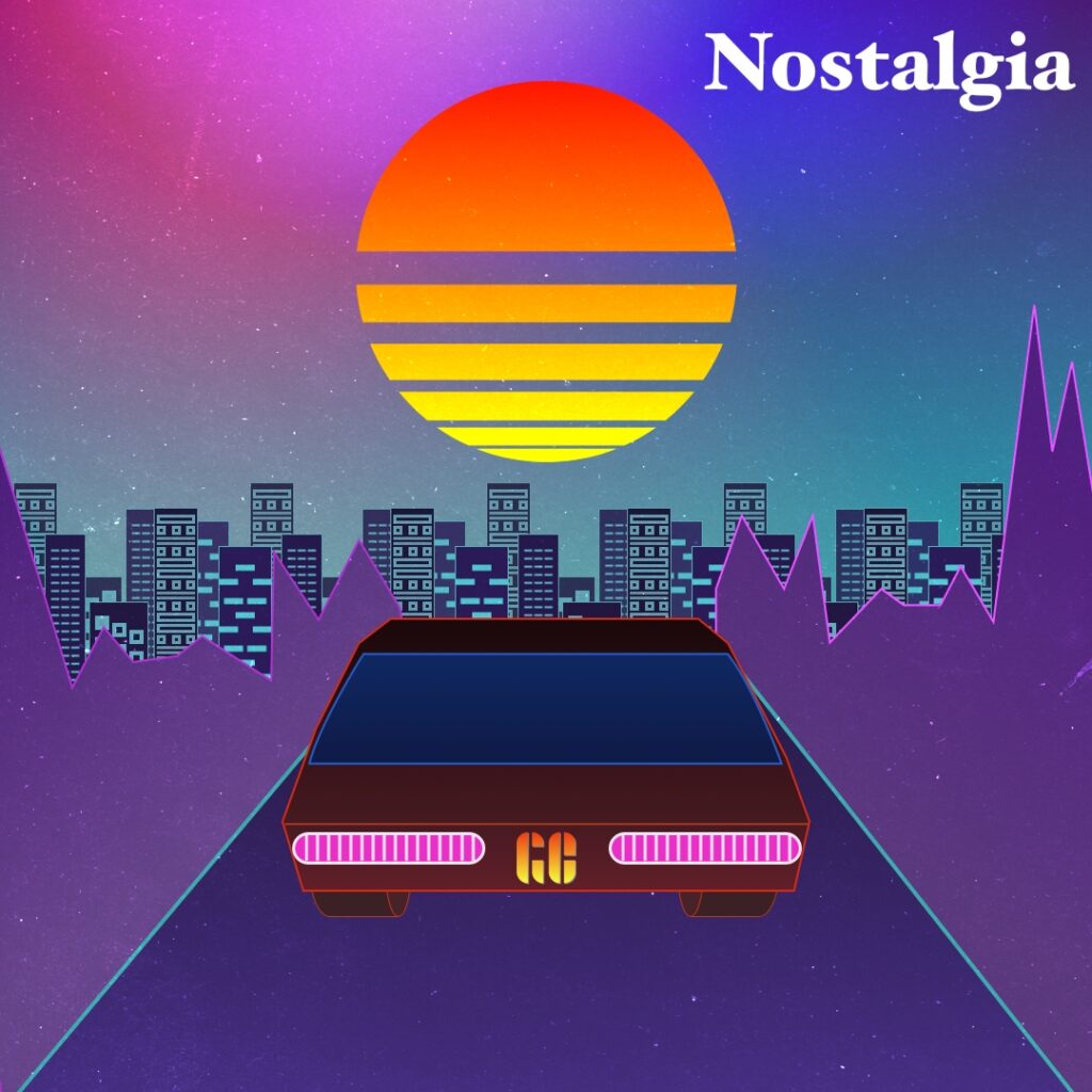
As futurism becomes more and more stale in the design world, a hark back to old times is becoming ever more popular. Drawing on nostalgia has proven successful for many popular brands.
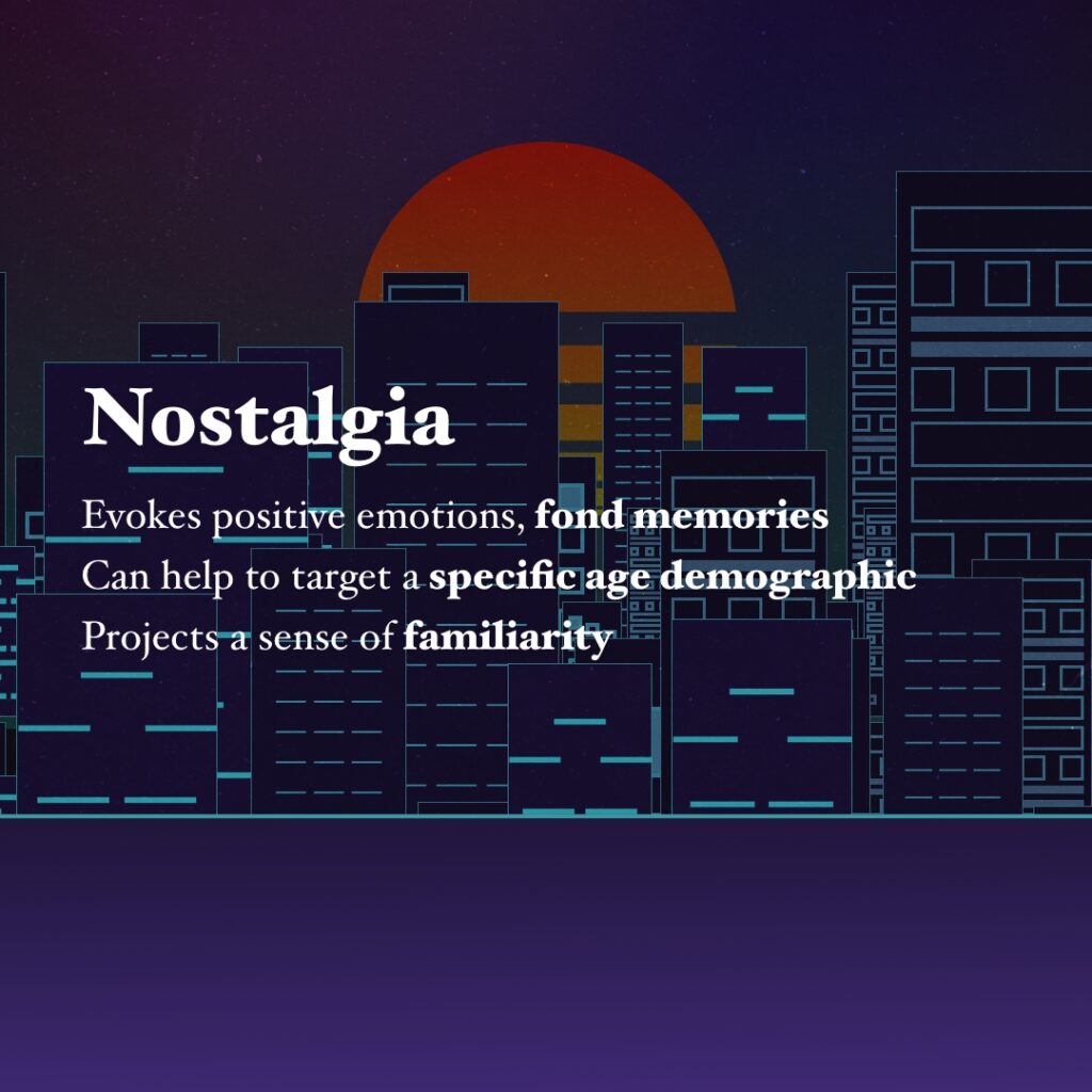
Nostalgia leaves you with a lot of breathing room for expressing personality in your marketing. When used correctly, the trend can be a strong way to convey a message to a specific demographic. It helps to reflect upon the prospect’s fond memories of events or features from older times while being presented as a sharper and more up-to-date concept.
A recent example would be Nintendo’s release of the NES Classic Mini. They designed this product to look and function in the same way as the classic NES, updated with modern features. It capitalised on an era that many of their client base remember vividly and could instantly be associated with a product a huge audience loved.
Even with smaller budgets in mind, nostalgia in design is an effective way to generate engagement with the intended audience.
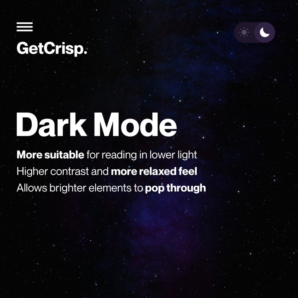
Dark Mode
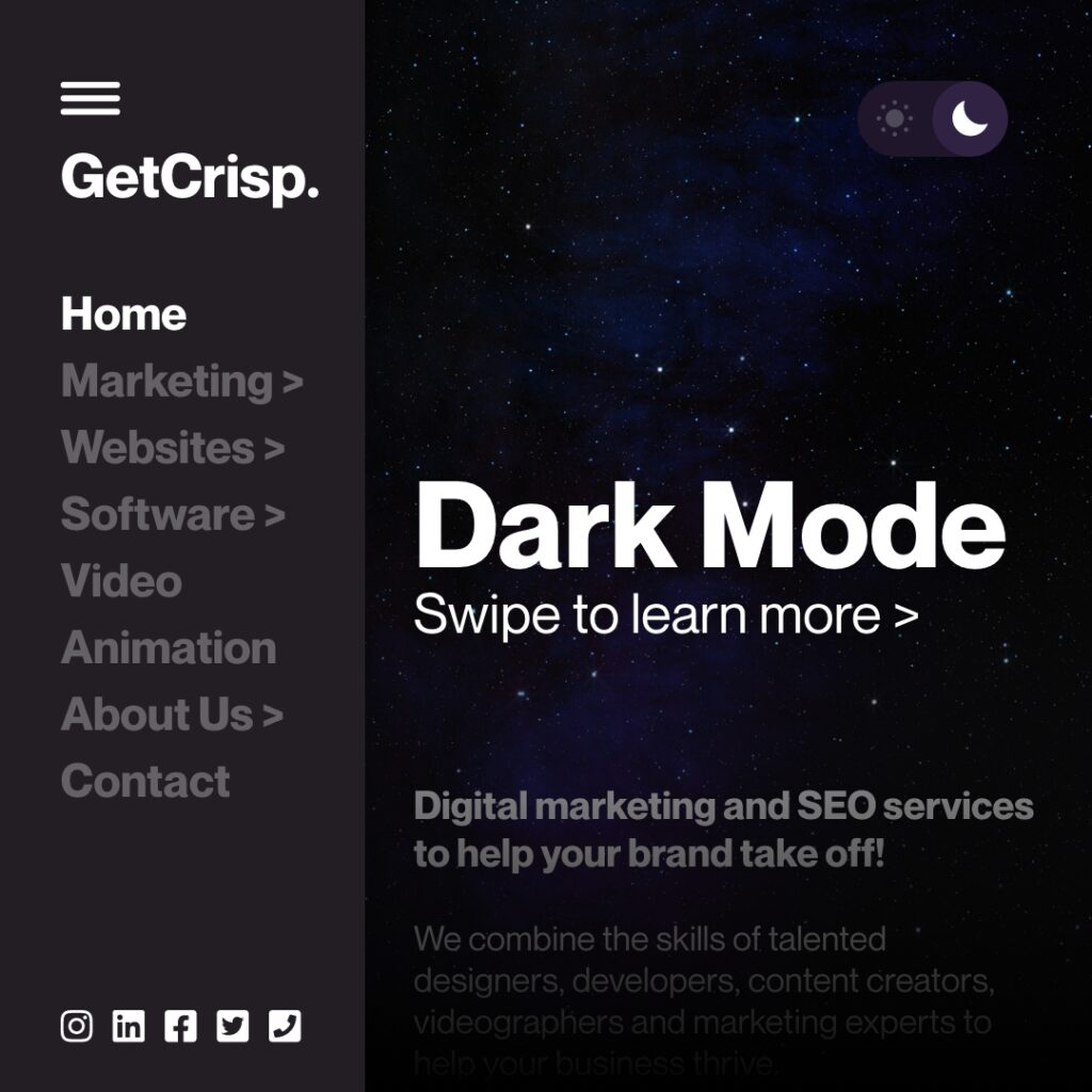
Taking a completely different view, many businesses are bringing their brands into the 2020s by adding Dark Modes to their websites, and incorporating darker colours throughout their marketing.
Not only is a darker theme much more suitable in lower light settings, but it also evokes a much sleeker and more professional feel than its stark lighter counterpart. Additionally, any brighter colours applied to messaging or imagery within the design have a chance to really stand out against the darker background, helping to accentuate certain products, branding or focal points.
Switching to dark mode can really help to bring an outdated page into the modern day, with just a switch of a toggle, breathing new life into websites and social posts. White backgrounds can be very distracting, and draw attention away from what you really want the consumer to focus on. Accessibility is still important though, make sure that whatever colour scheme you implement, it still caters to your entire audience.
Anti-Design
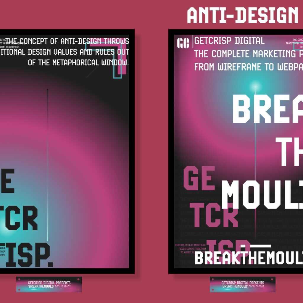
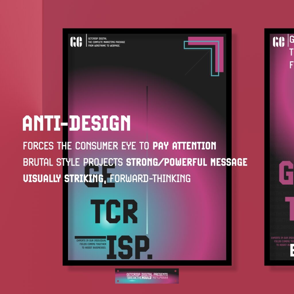
Don’t be fooled by the name. ‘Anti-design’ is not making something ugly, but rather going against traditional design principles. Artistic freedom really is the name of the game here.
Brutal typefaces and colours instantly catch a consumer’s eye, and it quickly focuses their attention on working out the messaging within the design. Within that, it enables the message itself to be strong and powerful after the striking first impression.
Bloomberg’s A Global Guide to State-Sponsored Trolling is a perfect example of how this trend can lead into the main focus of your post, coupled with an engaging headline.
Anti-designs are sharp and very forward thinking, and the placement of messaging can be key in really making a design like this work for your business. If you’re looking to have everyone talking about your company, or you’re looking to make a major release soon, then this trend is the one for you. The juxtaposition with the rest of your posts will really help it shine in a saturated social media feed.
That’s a wrap!
To summarise, when looking at why it’s good to stay up to date, these design trends will help to show you’re always active and keeping a keen eye on what people want to see.
Finding that cutting edge when your rivals may want to stick to the tried and tested could make all the difference, especially when this design is the first thing potential customers will see.
There’s no shame in following what’s popular; it’s just down to you to make sure you stand out. If you’re looking to incorporate these designs into your work, get in touch!
