The first websites as we know them today were launched in the early 1990s, shortly after Sir Tim Berners-Lee invented HTTP and HTML. The design of sites has evolved hugely since then thanks to advances in technology. In this blog post we’ll take you through the 5 main eras of web design.
1990-1994 – The Early Days
Sites in this period weren’t “designed” as such. The wider public hadn’t really caught on to the Internet quite yet, so most sites were written by professionals or researchers for other professionals and researchers. However, the basic principles of web design were starting to emerge by now. Information had to be clear and easy to read and thanks to the slow loading times, pages had to be well-optimised, so use of fancy images and tables was limited.

Late 1994-1998 – The Designer’s sandbox
By the mid-1990s, businesses were starting to take note of the Internet as a cheap way to market their services to the growing connected public. The first web banner appeared on the HotWired magazine site in October 1994 – American telecoms giant AT&T were the first to take the leap into advertising online, so send your angry postcards to them.
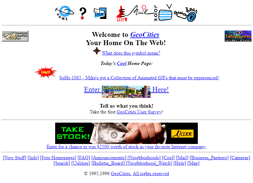
GeoCities, launched in November 1994, was many people’s first foray into the web. Giving users a whopping 2MB of online storage allowed gifs and colourful backgrounds to start to dominate the web landscape.
It was in this period that major technologies emerged one after the other. JavaScript appeared in late 1995, bringing popups with it, and CSS and Flash were both launched in December 1996. Designers around this time somewhat lost the plot, playing freely with these new tools to create ever-more garish and flashy websites. The idea of ‘User Experience’ was clearly brand new around this time; it was more important for designers and developers to show off their skills.
The website for the film Space Jam was one of the first sites created to promote a movie. It was a massive success, so much so that Warner Bros have kept the site live ever since. It’s fascinating to look back on now – this was once considered state of the art!
1999-2007 – Web 2.0 and the UX revolution
By the turn of the century web users were getting tired of the constant barrage of gifs, flashing text and slow-loading Flash-animated homepages. Designers, finally getting to grips with the tools at their disposal, started to listen and toned down their sites to make them easier to use.
This meant employing people with actual design experience to think from a user’s perspective about how a site will be used. CSS gave designers much better control over the appearance of websites, and together with the advancement of consumer PC equipment led to the widespread use of sidebars and high-resolution graphics.
In the second half of the 2000s interactive sites and user-generated content started to dominate the web landscape. Early social networks were launched and quickly gave way to Myspace and Facebook. This meant design started to become secondary to content and usability; Facebook’s simple blue and white colour scheme was always meant to be entirely unobtrusive.
With the proliferation of so many sites across the internet it became more and more important for site owners to get their pages to the top of search engine results pages. Since Flash content is invisible to search engines, Macromedia’s software started to disappear from the web landscape.

2007-2010 – The Mobile Revolution
The iPhone was launched in 2007, and with it came the explosion of the mobile internet and the death knell for Flash. This meant designers had to make sites that worked on a huge variety of screen sizes and devices. For the first few years this meant creating entirely separate mobile and desktop sites.
The mobile sites were typically much more lightweight and contained most of the same content as the desktop sites but typically used graphics and images more sparingly, drawing focus to the layout of the page itself. It was around this time that Ajax launched, allowing designers to make small changes to webpages based on user input without reloading the whole page.
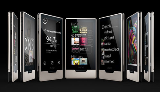
Although it’s now infamous as a biblical commercial failure, Microsoft’s Zune launched in late 2009 and introduced the world to flat design. Flat design focuses on a minimalist approach to design to maximise usability. Zune’s stark black and white interface still looks modern today due to its reliance on only a few very simple design elements.
2010-Present – Flat, responsive designs
By the start of the new decade designers and developers were sick of creating and maintaining two separate sites for mobile and desktop users. With mobile internet use rapidly catching up to desktop use, a new approach was needed. This created the era of responsive design.
Ethan Marcotte was the first to use the term “responsive design” and prompted designers to start creating sites that worked well on every device. This very quickly became the norm; making sites respond well to different resolutions by rearranging the existing content of a desktop site was clearly a much more sustainable approach than maintaining two sites.
These two approaches have combined over time into what we know today. Modern sites focus on high-quality graphics and photos mixed with simple colour schemes. Their main aim is to draw visitors’ eyes to content and copy rather than flashy design. With more than a billion sites now online, it’s more important than ever to get your main points across to visitors within seconds of them opening your site.
So that’s where we are now. The most important aim of a site now is to quickly and effectively convey your message, and to be eye-catching without letting design get in the way of the content. Interestingly the approach over time has evolved back towards the very early days of the web. Sites are now much more content-driven than they have been in perhaps the last 25 years, returning to the aim of quickly and clearly conveying ideas.